City Metal Letters for Sharp Corner
City Metal Letters for Sharp Corner
We Build Custom City Metal Letters
Crafting Identity: The Story Behind Sharp Corner’s City Metal Letters
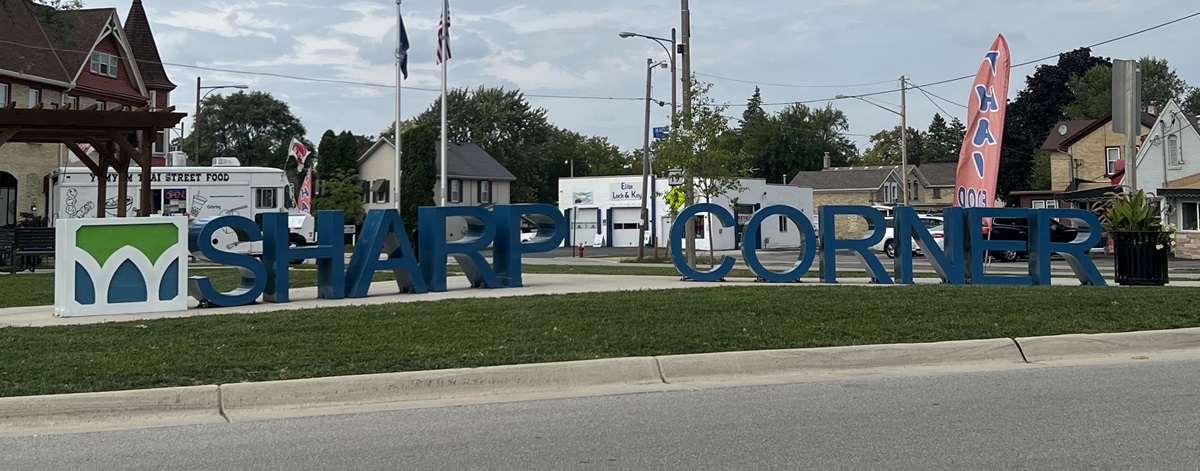
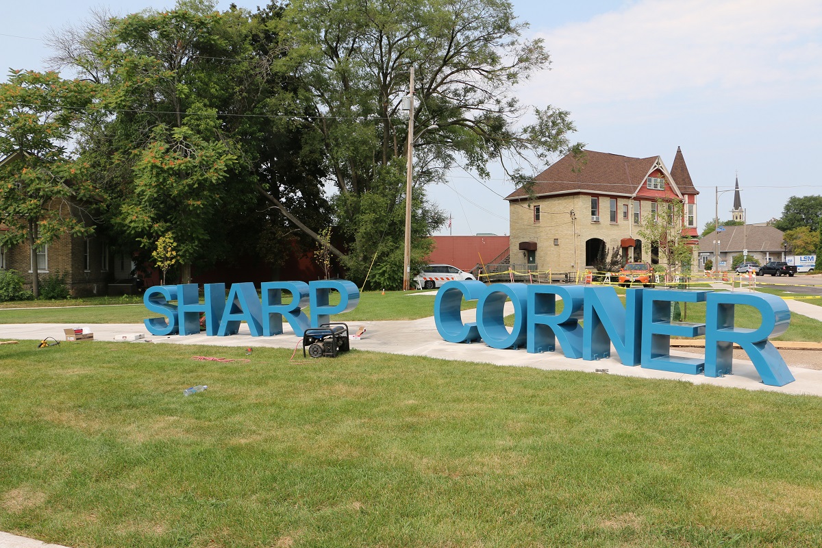
Nestled in the heart of Watertown, Wisconsin, Sharp Corners Park stands as a confirmation to community spirit and renewal. As part of the park’s redevelopment efforts, the Park and Recreation Commission embarked on a journey to enhance its identity. Central to this endeavor were the City Metal Letters for Sharp Corner – towering symbols of pride and transformation. In this blog, we delve into the fascinating process of crafting these iconic letters, exploring their significance, construction, and the spirit they embody.

Redevelopment and Renewal: Unveiling the Vision for Sharp Corners Park
As Watertown’s landscape evolved, so did the vision for Sharp Corners Park. With the approval of final designs for the park’s redevelopment, the stage was set for a transformational journey. Among the key elements of this revitalization effort were the Sharp Corner Park redevelopment and the commissioning of tall, permanent outdoor metal letters spelling out “Sharp Corner.” Funded by the Watertown Redevelopment Authority, these letters would serve as beacons of identity and pride for the community.
Craftsmanship in Motion: Building the City Metal Letters
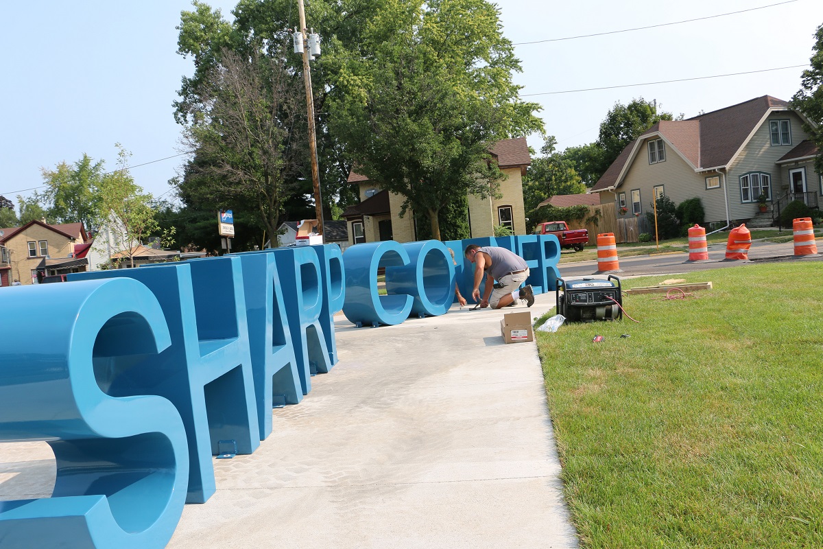
Crafting the City Metal Letters for Sharp Corner required a meticulous blend of artistry and engineering. Here’s a glimpse into the process:
Design: The process began with meticulous design work. Every curve, every angle, and every detail of the letters were carefully considered to ensure they matched the city’s vision and branding.
Precision Cutting: Once the design was finalized, WhiteClouds used state-of-the-art CNC (Computer Numerical Control) plasma-cutting machines to cut the metal with pinpoint accuracy. This ensured that each letter was a perfect representation of the original design.
Welding and Assembly: The individual components of each letter were expertly welded together, forming a seamless structure. Attention to detail during this stage was crucial to maintain the letters’ structural integrity.
Surface Finish: After assembly, the letters underwent meticulous surface preparation, including sanding and smoothing, to create a flawless canvas for paint application.
Painting: The choice of two-tone automotive paint added an extra layer of sophistication. This paint not only protects the metal from the elements but also gives the letters a glossy and polished finish.
Quality Control: Throughout the fabrication process, rigorous quality control measures were implemented to ensure that each letter met the highest standards of craftsmanship. Any imperfections were rectified before the final installation.
Embodying Identity and Pride: The Significance of Sharp Corner’s City Metal Letters
As visitors stroll through Sharp Corners Park, the City Metal Letters stand as symbols of identity, community pride, and transformation. Their sleek design and vibrant finish reflect the park’s renewed spirit and the collective vision of the community. Each letter, weighing approximately 45 pounds, serves as a reminder of the dedication and effort invested in revitalizing this cherished space. As Watertown continues to evolve, the City Metal Letters for Sharp Corner will remain timeless landmarks, celebrating the past, present, and future of this vibrant community.
Conclusion
In the heart of Watertown, amidst the lush greenery of Sharp Corners Park, stands a testament to community resilience and renewal – the City Metal Letters for Sharp Corner. More than just symbols, these letters embody the spirit of transformation and pride that defines the park and its surrounding community. As visitors explore the park’s winding paths and scenic vistas, the letters serve as silent guardians, guiding them on a journey of discovery and reflection. With each passing day, they stand as reminders of Watertown’s unwavering spirit and the enduring legacy of Sharp Corners Park.


