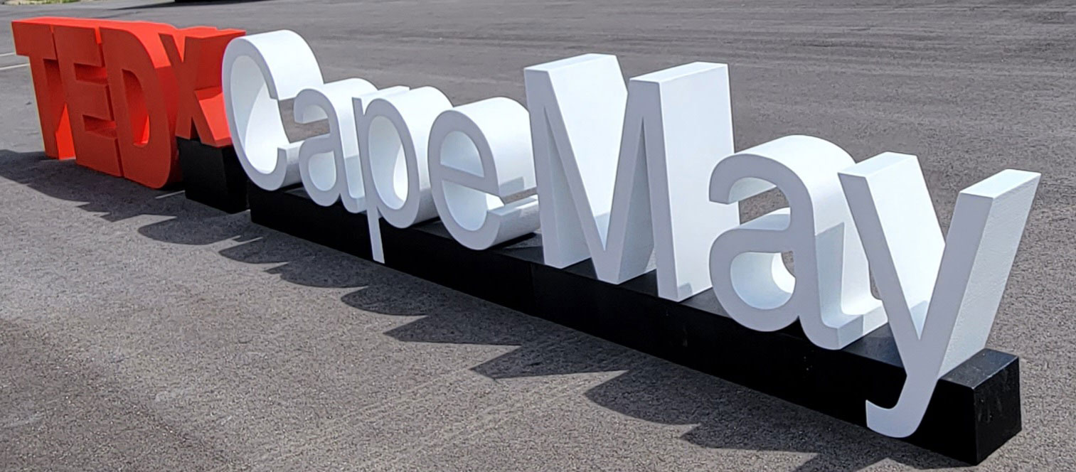
The TEDx Logo: A Symbol of Ideas Worth Spreading
The TEDx logo has become a globally recognized emblem, representing innovation, creativity, and the transformative power of ideas. Its clean, bold design is not just a visual identity—it’s a reflection of TEDx’s mission to spread ideas worth sharing. This logo is more than an aesthetic—it’s a rallying point for communities, organizations, and individuals to explore, discuss, and share transformative concepts. Let’s dive into the history, design, significance, and evolution of the TEDx logo and discover how it became an iconic symbol of inspiration and change.

The Origins of the TEDx Logo
The TEDx logo has its roots in the original TED logo, unveiled during the first TED Conference in 1984. With its bold, capitalized “TED” in vibrant red, the original logo emphasized simplicity and impactful communication. When TEDx was introduced in 2009 as an independently organized extension of TED, the logo was reimagined to suit its unique purpose.
The addition of the lowercase “x” symbolized independence and a localized focus while maintaining a strong connection to the TED brand. The design needed to be versatile and adaptable, allowing each TEDx event to pair the logo with its specific location or theme. This flexibility enabled the logo to reflect the individuality of each event while remaining part of a cohesive global brand.
The Design Elements of the TEDx Logo
The TEDx logo’s power lies in its simplicity. Its core design elements include:
-
Typography: The sans-serif font conveys a modern, professional aesthetic. Uppercase letters in “TED” emphasize authority and confidence, while the lowercase “x” adds accessibility and community focus.
-
Color: The bold red of “TED” symbolizes passion, energy, and urgency, while the black or white “x” text and location balance the design, maintaining clarity and elegance.
-
Structure: The linear arrangement of “TEDx [Location/Theme]” ensures visual uniformity, making the logo adaptable across various applications.
These design choices combine to create a logo that is visually striking, instantly recognizable, and deeply meaningful.
The Symbolism of the TEDx Logo
The TEDx logo is not just a visual marker—it is a symbol of connection, empowerment, and the exchange of knowledge. Each element of the logo carries symbolic meaning:
-
The “TED” Component: The foundation of the logo, it connects every TEDx event to the global TED brand. It represents the intellectual rigor, credibility, and inspiration that TED is known for.
-
The “x” Component: This lowercase “x” embodies independence, diversity, and community, signifying that TEDx events are independently organized yet aligned with TED’s principles.
-
Location/Theme: By incorporating the event’s location or theme, the logo is localized and personalized. Whether it’s TEDxTokyo or TEDxClimateAction, this customization makes the event relevant and relatable to its audience.
How the TEDx Logo Builds Global Recognition
The consistency of the TEDx logo has been pivotal in building its global identity. Regardless of location, every TEDx event uses the same fundamental design, creating visual continuity that unites events worldwide. This consistency fosters trust, signaling that each event adheres to TED’s high standards of quality and content.
For instance, attendees at TEDxSydney feel connected to the same global community as those attending TEDxMogadishu. The logo serves as a bridge, linking diverse events and participants in a shared mission to explore and spread ideas.
Customization and Creativity in the TEDx Logo
One of the most remarkable features of the TEDx logo is its adaptability. While the core design remains consistent, event organizers have the freedom to incorporate creative elements that reflect the unique character of their event:
-
Local Influences: Many TEDx events incorporate visual cues inspired by local culture, architecture, or natural surroundings. TEDxAmsterdam, for instance, has integrated design elements referencing the city’s iconic canals.
-
Thematic Variations: Events focusing on specific themes often adjust the logo to align with their topic. TEDxYouth, for example, uses vibrant colors to appeal to younger audiences.
-
Artistic Flourishes: Collaborations with local artists have resulted in customized logos that resonate deeply with the community while preserving the core TEDx branding.
These creative adaptations enhance the logo’s impact, turning it into both a symbol of the TEDx brand and a reflection of the event’s individuality.
Memorable Uses of the TEDx Logo
Over the years, the TEDx logo has been used creatively to enhance the branding and storytelling of various events. Here are a few standout examples:
-
TEDxSydney: The logo is often paired with visuals inspired by the Sydney Opera House, reinforcing the city’s cultural identity and the event’s role as a hub for creativity.
-
TEDxTokyo: The minimalist aesthetic of TEDxTokyo’s logo aligns with Japan’s design traditions while incorporating futuristic elements, perfectly reflecting the event’s focus on technology and culture.
-
TEDxCapeTown: Vibrant colors and patterns inspired by South African heritage emphasize the event’s themes of inclusivity and community impact.
-
TEDxMogadishu: Earthy tones and organic shapes in the logo symbolize resilience and renewal, reflecting the event’s mission to inspire hope and innovation in Somalia.
The Role of the Logo in Marketing and Merchandise
The TEDx logo plays a central role in event promotion and audience engagement. From banners and posters to social media graphics and merchandise, the logo is a cornerstone of TEDx branding. Some key applications include:
-
Swag Items: T-shirts, tote bags, notebooks, and mugs featuring the TEDx logo are popular souvenirs, giving attendees a tangible connection to the event.
-
Digital Platforms: The logo is prominently displayed on event websites, social media profiles, and promotional videos, serving as a visual anchor for digital content.
-
Stage Design: Illuminated TEDx logos or logos integrated into stage backdrops reinforce the brand identity during live events.
These uses ensure that the TEDx logo remains visible and memorable, strengthening the overall brand.
The Evolution of the TEDx Logo
While the TEDx logo has retained its core design since its inception, subtle updates have kept it relevant in an ever-changing world. These updates include:
-
Modern Typography: Refinements to the font have made the logo more streamlined and versatile.
-
Responsive Design: As digital platforms became central to communication, the logo was optimized for smaller screens to ensure clarity and legibility.
-
Sustainability: Eco-friendly materials are now often used for signage and merchandise, reflecting TEDx’s commitment to sustainability.
These updates demonstrate TEDx’s dedication to staying at the forefront of design trends and audience needs.
The Future of the TEDx Logo
As TEDx continues to expand and innovate, its logo is likely to evolve further. Emerging trends that could influence its future include:
-
Augmented Reality (AR): Incorporating AR elements into the logo could create interactive experiences for attendees.
-
Dynamic Branding: Animated versions of the logo could enhance its appeal on digital platforms.
-
Localized Designs: Future logos may incorporate more regional languages, symbols, and cultural references to resonate with diverse audiences.
These innovations will ensure that the TEDx logo remains a powerful symbol of inspiration and progress.
Conclusion: The TEDx Logo as a Global Icon
The TEDx logo is far more than a graphic design—it’s a symbol of the transformative power of ideas. From its bold red letters to its adaptable structure, the logo encapsulates the essence of TEDx: a movement that connects people, inspires change, and celebrates creativity.
Whether it’s displayed on a stage in Tokyo or printed on a tote bag in Cape Town, the TEDx logo reminds us of the shared mission to spread ideas worth sharing. As TEDx continues to grow, the logo will remain a beacon of inspiration, uniting communities and amplifying voices across the globe.
