Top 10 Cartography Tips
Top 10 Cartography Tips
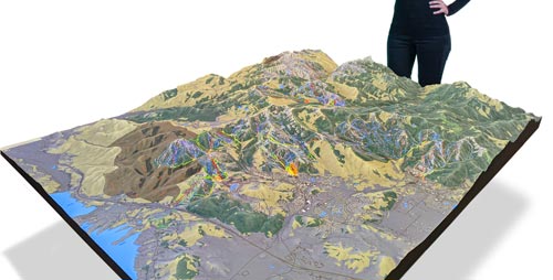
WhiteClouds builds 3D Raised Relief Maps
Cartography, the art and science of mapmaking, is as much about creativity as it is about precision. Maps have guided humanity through exploration, trade, and conquest, shaping our understanding of the world. To craft an effective map, whether for navigation, education, or storytelling, requires skill, knowledge, and attention to detail. This list dives into the top 10 cartography tips, offering insights and anecdotes to inspire and guide aspiring mapmakers.
#1: Understand Your Audience – Essential for Success
Understanding your audience is the foundation of any successful map. Whether you’re creating a map for hikers, city planners, or students, knowing their needs and expectations will dictate the design and content. For instance, a topographic map for hikers requires detailed elevation data, while a city map for tourists focuses on landmarks and public transit. The famed cartographer Gerardus Mercator designed his maps specifically for sailors, using a projection that preserved compass directions, which revolutionized navigation.
Throughout history, maps have been tailored to serve specific purposes, from military strategies during wars to educational tools in classrooms. Knowing your audience allows you to decide what to include or exclude, ensuring clarity and relevance. This principle remains crucial as cartography evolves with digital tools, allowing for interactive and customizable maps.

#2: Prioritize Simplicity – Less is More
Simplicity is key in cartography, as an overly cluttered map can confuse rather than inform. Focus on essential elements, such as boundaries, landmarks, and key routes, while avoiding unnecessary details. A simple, clear design ensures that viewers can quickly grasp the map’s purpose. The iconic London Tube map by Harry Beck is a classic example, with its schematic design prioritizing readability over geographical accuracy.
Cartographers often face the challenge of balancing simplicity with comprehensiveness. Anecdotes from historical mapmakers, like the creators of early atlas maps, highlight the struggle to condense vast amounts of information into manageable formats. Today’s digital maps often incorporate layers, allowing users to toggle between detailed and simplified views, adhering to this principle.

#3: Use Consistent Symbols – Communicate Clearly
Symbols are the language of maps, conveying information quickly and universally. Consistency in symbols, colors, and shapes ensures that viewers can interpret the map without confusion. For instance, blue is universally recognized as representing water, while green often indicates forests or parks. Early explorers relied on standardized symbols to chart new territories, which laid the groundwork for modern mapping conventions.
The use of consistent symbols has also been pivotal in global mapping efforts, such as the United Nations’ efforts to standardize humanitarian maps. Anecdotes from these initiatives underscore the importance of clear, universal communication in diverse contexts.
#4: Master Scale and Projection – Accuracy Matters
Scale and projection are crucial considerations in mapmaking, as they determine how much detail is included and how the Earth’s curvature is represented. Choosing the right projection depends on the map’s purpose. The Mercator projection, for example, is excellent for navigation but distorts size at the poles. In contrast, the Peters projection prioritizes area accuracy.
The history of cartography is rich with debates over projections, such as the rivalry between Mercator and Peters advocates. Modern GIS tools allow cartographers to experiment with different projections, ensuring the most accurate representation for their goals.
#5: Balance Aesthetics and Functionality – Art Meets Science
A well-designed map is both beautiful and functional, combining aesthetics with usability. Striking this balance requires attention to color schemes, typography, and layout. The artistry of ancient maps, such as the illuminated manuscripts of medieval Europe, illustrates the importance of visual appeal in engaging viewers.
Modern cartographers often draw inspiration from historical designs while incorporating contemporary techniques. For instance, National Geographic maps are renowned for their balance of detailed information and artistic presentation.
#6: Incorporate Interactivity – Embrace Technology
Interactive maps have revolutionized cartography, allowing users to explore data dynamically. Features like zooming, panning, and clickable layers enhance user engagement and understanding. Platforms like Google Maps have set new standards for interactivity, making mapping accessible to everyone.
Stories from the development of early interactive maps highlight the challenges of integrating technology with traditional cartographic principles. Today, the fusion of GIS software and interactive design continues to expand the possibilities of mapmaking.
#7: Ensure Data Accuracy – Trust the Details
Accuracy is the cornerstone of cartography, as even small errors can lead to significant misunderstandings. Historical examples, such as miscalculations in early nautical charts, underscore the importance of precise data. Modern cartographers rely on satellite imagery, GPS, and rigorous data verification to ensure reliability.
Anecdotes from explorers who relied on flawed maps, such as the doomed Franklin Expedition, highlight the consequences of inaccuracy. Ensuring data integrity remains a top priority for professional mapmakers.
#8: Highlight Key Features – Guide the Viewer’s Eye
A good map emphasizes its most important elements, guiding the viewer’s eye to critical information. Techniques like bold labels, contrasting colors, and strategically placed icons can make key features stand out. This principle is evident in thematic maps, such as election results maps, which use color-coding to communicate complex data at a glance.
Historical examples, like John Snow’s cholera map in 1854, demonstrate how highlighting key features can reveal insights and drive action. Modern cartographers continue to refine these techniques to enhance clarity and impact.
#9: Adapt to Context – One Size Doesn’t Fit All
Maps must be tailored to their specific context, whether it’s cultural, environmental, or technological. Understanding the unique characteristics of a region or audience ensures relevance and effectiveness. For instance, Indigenous mapmaking traditions often incorporate cultural landmarks and oral histories, offering a unique perspective.
Stories from global mapping projects, such as the International Cartographic Association’s efforts, highlight the importance of adapting to diverse contexts. Modern tools like GIS make it easier to customize maps for specific needs and audiences.
#10: Keep Updating – Maps Are Never Finished
Maps are living documents that must evolve with changing landscapes, technologies, and information. Regular updates ensure that maps remain accurate and relevant. The history of cartography is filled with examples of maps being revised to reflect new discoveries, from the addition of the Americas to world maps in the 16th century to the ongoing adjustments to reflect climate change.
Digital platforms, such as OpenStreetMap, exemplify the dynamic nature of modern cartography. Anecdotes from contributors highlight the collaborative spirit of mapmaking, ensuring that maps continue to serve their users effectively.
Cartography is both an art and a science, requiring skill, creativity, and a deep understanding of geography and design. These top 10 tips provide a foundation for creating effective, engaging maps that inform and inspire. From mastering scale and projection to embracing technology and maintaining accuracy, these principles guide cartographers in navigating the complexities of the world and bringing it to life through their craft.


