Maps are more than just visual representations of geographic spaces; they are keys to understanding our world, tools for discovery, and guides for navigation. From the earliest hand-drawn sketches of the known world to the high-tech digital maps that guide our daily lives today, maps have always served as a means to decode the complexities of the Earth. They help us comprehend everything from the scale of continents to the intricacies of a neighborhood street. Maps are used not only for practical purposes, like travel and urban planning, but also for deeper exploration—enabling scientists to track climate patterns, study ecosystems, and predict natural disasters. Historically, maps have charted human progress and curiosity, from explorers’ journeys to the discovery of new lands, to military conquests and the expansion of empires. But maps also hold cultural significance, reflecting the way people viewed and understood the world in different eras, often revealing biases and perceptions of power. Today, with the rise of GIS technology, maps have evolved into dynamic, real-time representations that can change with new data, giving us unprecedented insights into everything from environmental changes to urban sprawl. The importance of maps lies not only in their ability to orient us in the physical world but in their capacity to inform decisions, influence policy, and inspire curiosity, making them essential tools in shaping our future and preserving our past.
Top 10 Most Amazing Maps
Top 10 Most Amazing Maps
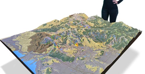
WhiteClouds builds 3D Raised Relief Maps
Maps have always been more than just representations of land and territory; they are windows into the past, tools of exploration, and sources of inspiration. From ancient maps that guided the world’s greatest explorers to modern cartography that helps us understand the complexities of our planet, maps offer both functional and artistic value. The following list highlights the top 10 most amazing maps, each notable for its size, historical importance, or unique features that have made them stand out in the world of cartography. These maps not only depict the Earth’s geography but also offer insights into the human experience, scientific discoveries, and artistic ingenuity. Let’s explore these incredible maps, ranked by their size and significance.
#1: The Piri Reis Map, 500,000 Square Miles
The Piri Reis Map is an ancient map created in 1513 by the Ottoman admiral and cartographer Piri Reis. Measuring an astounding 500,000 square miles, the map is significant for its depiction of the coastlines of Europe, Africa, and the Americas. What makes this map especially amazing is its accuracy, considering the limited technology available at the time. The map shows parts of the South American coastline, including the coast of Brazil, and notably features what some believe to be a detailed representation of Antarctica, which was not supposed to be discovered until the 19th century. The Piri Reis map has intrigued historians, geographers, and conspiracy theorists alike, with some suggesting that the map provides evidence of lost ancient civilizations or advanced knowledge. An interesting anecdotal story about the map comes from its rediscovery in the 1920s when it was found in the Topkapi Palace in Istanbul. The map remains a subject of study and fascination, symbolizing the advanced knowledge of the Ottoman Empire in the 16th century.
#2: The Tabula Rogeriana, 500,000 Square Miles
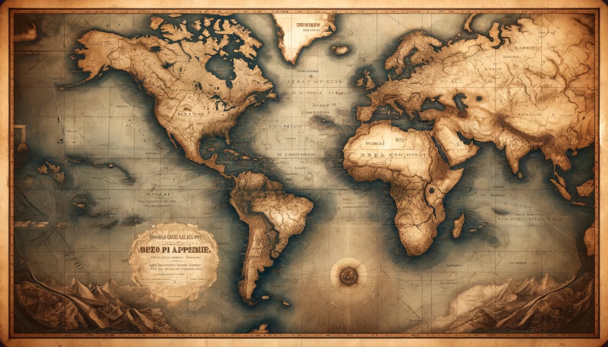
Created by the Arab cartographer Al-Idrisi in 1154, the Tabula Rogeriana is one of the most detailed and accurate maps of the world from the medieval period. Measuring about 500,000 square miles, it was commissioned by the Norman King Roger II of Sicily and provides an astonishingly precise view of the world as it was known to Arab and European scholars in the 12th century. The map is unique in its orientation; instead of placing north at the top, Al-Idrisi oriented the map with the south at the top, reflecting the geographical understanding of the time. It features detailed representations of Europe, Asia, and Africa, with a particular focus on the Mediterranean region. The map was used extensively by travelers and traders during the medieval period and was highly regarded for its precision and usefulness in navigation. An interesting fact is that the map’s success was due to the blending of both Arab and European geographical knowledge. The Tabula Rogeriana remained the most accurate world map for centuries, influencing the development of subsequent maps.

#3: The Waldseemüller Map, 600,000 Square Miles
The Waldseemüller Map, created in 1507 by German cartographer Martin Waldseemüller, is one of the most famous historical maps. Measuring 600,000 square miles, this map is significant because it is the first known map to use the name “America,” in honor of Amerigo Vespucci, the explorer who suggested that the lands discovered by Europeans were part of a new continent. The Waldseemüller map provides a detailed view of the New World, as well as the known parts of Europe, Asia, and Africa. What makes this map so amazing is that it combines the latest discoveries of the time with geographical knowledge from ancient sources, creating a map that is both modern and rooted in historical tradition. The map was a major step forward in European understanding of world geography and has been credited with shaping how the continents were viewed and understood. Anecdotal stories about the map often highlight how it sparked a wave of exploration and interest in the Americas during the Age of Discovery.
#4: The Mercator Projection Map, 2,000,000 Square Miles
Created in 1569 by Gerardus Mercator, the Mercator Projection Map revolutionized navigation by presenting the world on a flat surface with straight lines, making it easier to chart and follow long-distance sailing routes. Spanning around 2,000,000 square miles, the Mercator map was a breakthrough in cartography, as it allowed sailors to plot courses based on straight lines, known as “rhumb lines,” which significantly simplified the process of navigation. The map’s projection, however, distorts the size and shape of landmasses as they approach the poles, making areas like Greenland appear much larger than they are. Despite this, the Mercator projection remains one of the most widely used map projections, particularly for navigation. One interesting fact about the map is that it became the standard for world maps and was used by explorers for centuries. Anecdotal stories about the Mercator map often focus on how it helped guide explorers like Christopher Columbus and Vasco da Gama on their sea voyages, playing a crucial role in the Age of Exploration.
#5: The 1789 North America Map, 1,000,000 Square Miles
The 1789 North America Map, created by the French cartographer Jean-Baptiste Bourguignon d’Anville, covers approximately 1,000,000 square miles and provides an early and detailed view of North America. What makes this map so remarkable is the level of detail it provides for the time, showing the outlines of the United States, Canada, and parts of Mexico. This map was created just a few years after the American Revolution, and it reflects the political and geographical changes of the period. The 1789 map also includes Indigenous territories, rivers, mountains, and the locations of important settlements, offering a snapshot of the New World before much of it had been explored. One interesting fact is that this map was used by both the French and British in their colonial planning and trade, making it an important piece of cartographic history. The map’s historical significance is evident in its inclusion of early U.S. territories, such as the Midwest and Western regions, which would later become the focus of westward expansion.
#6: The Beauplan Map of Ukraine, 800,000 Square Miles
The Beauplan Map of Ukraine, created in 1648 by French cartographer Guillaume Le Vasseur de Beauplan, spans 800,000 square miles and offers a detailed representation of Ukraine and surrounding regions. What makes this map particularly amazing is its role in the mapping of Eastern Europe during a time of political turmoil and shifting borders. The map depicts Ukraine as a frontier territory in the context of the Cossack Hetmanate, which was an autonomous state under the suzerainty of the Russian Tsar. It includes detailed features like rivers, fortifications, and settlements, providing a comprehensive look at the geography of the region. One interesting aspect of the Beauplan Map is that it became a crucial tool for military strategists, particularly during the wars involving the Cossack uprisings against the Polish-Lithuanian Commonwealth. Anecdotal stories about this map focus on its importance in the defense of the Ukrainian state and its influence on later cartographers in the region.
#7: The 1854 London Cholera Map, 300,000 Square Miles
The 1854 London Cholera Map, created by physician John Snow, is one of the most important maps in the history of public health. Spanning roughly 300,000 square miles, this map visually represents the cholera outbreak that struck London in the mid-19th century. What makes this map so amazing is how it demonstrated the link between contaminated water sources and the spread of the disease, essentially founding the field of epidemiology. Snow’s map identified a cluster of cholera cases around a contaminated public water pump on Broad Street, which led to the eventual removal of the pump handle and the prevention of further outbreaks. An interesting anecdotal story about this map is that it marked a turning point in how diseases were understood and addressed, shifting from the prevailing belief in miasma (bad air) to the understanding that pathogens in water could cause disease. This map saved countless lives and is still used as an example in public health courses today.
#8: The London Underground Map, 100,000 Square Miles
The London Underground Map, designed by Harry Beck in 1931, is one of the most famous and iconic transit maps ever created. Although it spans only about 100,000 square miles in its real-world context, the map’s importance lies in its revolutionary design. Beck’s simple, abstract layout of the underground rail system—using straight lines and simplified station names—changed the way transit maps were conceptualized. It was a dramatic departure from traditional maps that attempted to show geographical layouts, opting instead for a more user-friendly, functional approach. The map has become a global standard for urban transit systems and has influenced the design of subway maps in cities around the world. One interesting fact about the London Underground Map is that it was initially met with resistance, but over time it became one of the most beloved and recognizable maps in the world. The map’s impact on urban planning and public transport cannot be overstated, and it has played a key role in making London’s public transport system more accessible.
#9: The 2000 Millennium Map, 500,000 Square Miles
The 2000 Millennium Map, created by cartographer Mark Ovenden, offers a striking and modern visual representation of the world at the turn of the millennium. Spanning around 500,000 square miles, the map is designed to show how human civilization has impacted the planet over the past century. It includes detailed data on urbanization, population growth, and the spread of technology, making it a fascinating snapshot of the global landscape at the cusp of the 21st century. The Millennium Map uses vivid colors to highlight population density, energy consumption, and technological advancement, making it visually appealing as well as informative. One interesting aspect of this map is its ability to depict the rapid globalization that occurred in the 20th century. Anecdotal stories about this map often describe how it served as both a tool for reflection and a symbol of hope for the new millennium.
#10: The 2012 Google Earth Map, Global
The 2012 Google Earth Map, spanning the entire globe, is one of the most modern and comprehensive digital maps available today. Powered by satellite imagery and geographic data, Google Earth provides a three-dimensional view of the Earth’s surface, allowing users to zoom in on virtually any location on the planet. The map’s global coverage, combined with real-time data, makes it an incredible tool for exploration, education, and scientific research. What makes this map so amazing is its accessibility—anyone with an internet connection can use it to explore the world from the comfort of their home. An interesting feature of Google Earth is the ability to see changes in the landscape over time, providing a visual representation of urban growth, environmental changes, and natural disasters. Google Earth has become an indispensable tool for everything from travel planning to scientific studies and disaster relief efforts.
Maps are more than just tools for navigation—they are windows into the past, mirrors of human civilization, and key instruments for understanding our world. From the ancient Piri Reis map to the modern digital landscape of Google Earth, each map tells a unique story, shedding light on how humans have interacted with, explored, and shaped the Earth. These amazing maps are a witness to the power of cartography in shaping history and guiding the future.
